Prime Pharmaceuticals’ Fake Images
An examination of Prime Pharmaceuticals’ old before-and-after images.
August 3, 2002, Update: Please see the Oregon Grape Page for important information about this company. The remainder of this page is primarily of historic interest.Prime Pharmaceutical Corporation’s web site, back in May of 1999 when we on the Newsgroup first heard about them, had a couple of dubious before-and-after photos right at the top of their homepage. At some point prior to June 22, 1999, they had redone the images, but the “before” image was still an obvious forgery. Now, on August 24, 1999, I find they’ve removed the before-and-after photos completely, and replaced them with “Is This You?” photos of two different body parts with some sort of unidentified dermatoses.
On June 22, because the images had changed, and someone on the newsgroup has mentioned sending Prime an email talking about the photos, I decided to run some analyses on the pictures mostly to prove to myself that they were the same, except for some airbrushing.
Even after the most cursory of examinations, the June 22 photos were obviously identical. The lock of hair over the right shoulder (green arrows in images) is a dead giveaway under a close inspection, but the position of the body in general is the most obvious clue.
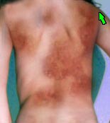 Before | 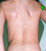 After |
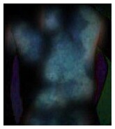
Finally, I enhanced the contrast of the image that resulted, because without such enhancement, the brightest pixels are pretty dark. The contrast enhancement serves only to highlight the differences in the pictures more, and to brighten up what was originally quite a murky picture (as you can see).
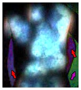
The background colors are different (red and purple arrows), so it’s obvious that someone was trying hard to disguise the forgery. But what’s really important here is the outline of the torso and arms themselves. Very black, and very crisp. This indicates that there’s hardly any difference at all between the two photos in terms of the position of the body, and that small lock of hair over the right shoulder. How often would something like this occur in reality? I think the odds are incredibly small that this “patient” stood in exactly the same way for both photos, which, if real, must have been separated by weeks or months of time.
The original photos had a very obvious bunch of hair which was the first clue to several newsgroup readers that the photos were faked (yellow arrows). The lock of hair in the newer images, above, even makes an appearance in the “after” photo (green arrow). That hair doesn’t show up in both photos because they’re cropped differently.
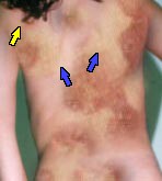 Old Before Image | 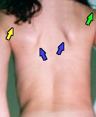 Old After Image |
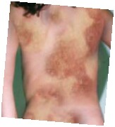
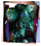
And the following is a comparison of this rotated, older “before” image with the newer “before” image, with the same amount of contrast enhancement as was used to compare the two newer images to each other, above. Most of the light-greenish mottling across the torso in this image is due to a change having been made of the “disease” in the newer “before” image. The outlines of the arms and torso match up very well, though not perfectly as is evidenced by the red and blue stripes that are visible (gray arrows). The difference in the shoulder-blade shadows between the older and newer images shows up really well here as a bright diagonal line (blue arrow). The arms are a good, solid black, which means they match up very well, so the 5° rotation isn’t too far from correct (also, the act of rotating the image introduces some differences by itself, but this is not really the place to enter into a discussion about digital image processing). The really bright blob in the top-left portion of the image is, of course, the locks of hair in the older photo (yellow arrow).
To sum this up, these photos were quite obviously faked, and two “different” sets of photos shown on the site were also obviously one set of photos, just cropped differently, and rotated a slight amount. From the available evidence, they’ve got one photo of someone with a perfectly normal back, and this image had been modified digitally several times (or scanned and modified multiple times, which could account for the differences in rotation and size). Prime was trying to fool us, and doing an extremely bad job of it. I believe the World in general should feel insulted by these kinds of tricks, and sufferers of psoriasis, eczema and “other dry skin conditions” in particular should feel enraged at this kind of advertising.
August 3, 2002, Update:: Please see the Oregon Grape Page for important information about this company. This page is primarily of historic interest.